Feeds:
Posts
Comments

Posts Tagged ‘ideas’

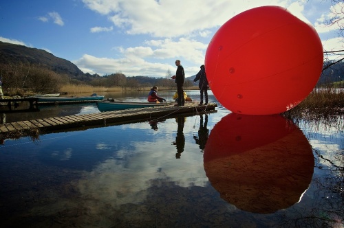
‘Whistle’ is about more than just a whistle. It’s about time – the here and now as well as historical, and place – both the ‘North’ and the individual places of the whistles. What the whistles do is link all those big and small ideas together.

At the heart of ‘Whistle’ of course are the whistles themselves.

As with previous incarnations, it was really important to get the right whistle and make it sound right. But as the project progressed the creation of the whistles took on their own narrative.

It started at the North Yorkshire Moors Railway in October last year. We went to see an LNER B1 locomotive in action and hear what the whistle sounded like.  The driver that day was a little reluctant to sound the whistle for any more than absolutely necessary for fear of upsetting the neighbours, so I could only snatch little snippets of sound but enough to get a feeling for the character of the whistle, and importantly, a pitch.

The whistle on a B1 is an ‘LNER standard design whistle’. It’s name is a little misleading as the London and North Eastern Railway had a number of different ‘standard’ designs over the years. The smaller bell-designed whistles on the large express locomotives, like ‘Flying Scotsman’ were higher in pitch but lacked a full bodied tone. The streamlined ‘A4 pacifics’ like Mallard drew heavily on their design from the massive art deco styled american locos and their whistles were similarly drawn from the US with distinctive tri-tone chime whistles. While these whistles were certainly distinctive and would have been a common sound in Newcastle up until the end of steam, these were quite complicated and expensive things to manufacture. The LNER imported their whistles from a Chicago based manufacturer, whereas the 1920’s ‘Standard Whistle’ was more homegrown in its design.

The first step to building a replica whistle was to see how the originals were built. I couldn’t find one for sale anywhere so instead with the help of the North East Locomotive Preservation Group, we took one off a loco at the historic carriage works in Darlington and took it apart to see how it went together.

IMG_5518

Whistles were traditionally made by apprentices at loco works. They were a great way to demonstrate a wide range of engineering skills without the precision and reliability of a mechanical part. So, while there are drawings for the whistles, the parts as constructed vary from piece to piece and no two are ever exactly the same.

The whistles for the piece were to be powered by cylinders of compressed air. While the principle of sounding whistles the way had been proven with my previous piece, this time the whistles would be outdoors for over three months in all weather and would need to fire reliably every day. On top of that, at least one of the whistles would be indoors and would need to be significantly quieter so it didn’t deafen the public.

A period of testing took place over a couple of months to find out how everything behaved in various conditions. We tested various solenoid valves to see what difference they made to the overall sound volume. The same with different brands of air regulators. Whistles were fired at different air pressures to find the optimum working pressure. A whistle was sounded repeatedly in a remote part of the countryside to find out how many blasts we could get out of each cylinder of air and in a separate test, we needed to see if rain got into the whistles and what would happen if it did. Importantly we needed to find out just how loud the whistles were  and also, how could we make a whistle quieter without ruining the tone?

With any project that’s not been done before, you really can’t do too much testing – as we were to later find out.

— — — —

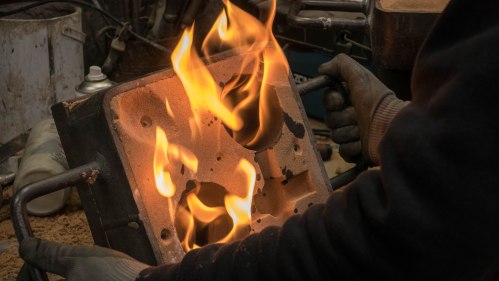
The bell type whistle we used has been around for over a century and was built using the techniques and skills commonly used in loco building. We started off looking to see if there were any improvements we could make to the manufacturing process using modern techniques, but after a number of failed attempts we resorted to the same tried and tested techniques as the originals.

IMG_5513 2

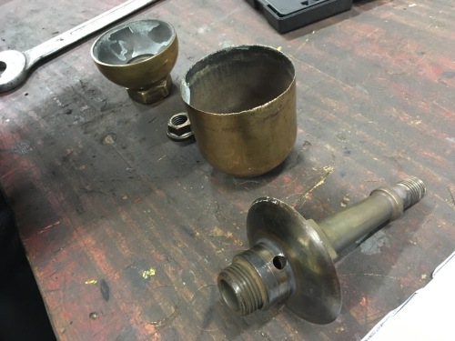
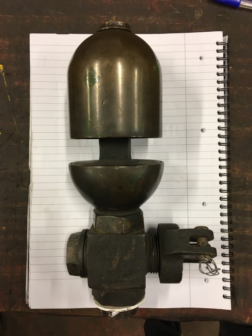
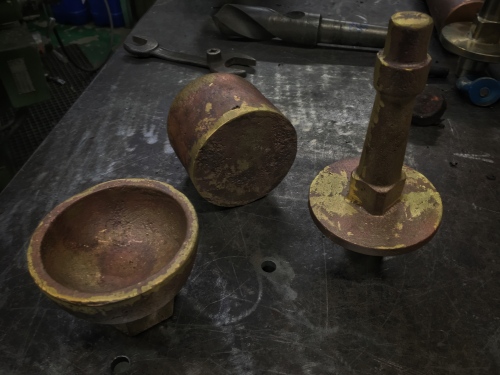
original whistle in its constituent parts

The whistles are made in three parts – a large bell over the top, a cup at the base and a central stem that sat inside the cup that made the important air gap and held the whole whistle together. The key factors in the volume, pitch and tone of the whistle are the size of the gap in the bottom cup – this creates a column of air that is split by the lip of the bell and makes the sound. The cleanliness of the tone, and to a certain extent the volume is determined by the sharpness of the bell edge. The bell edge has to sit at a sweet point above the cup for the note to ring well. If the gaping the cup is too big or the bell edge is too blunt, the tone is muddied and the volume is reduced. Get everything just right and at the right air pressure the whistle screams loudly and the bell rings with a beautiful harmonic overtone.

As with the previous whistle piece, the whistles had to be re-tuned to allow for the colder temperature of compressed air as opposed to steam in the originals. This was done with a plate cast as part of the central pillar. In the finishing stages this plate could be machined at different thicknesses and heights to give a variety to the final notes. We could have made all the whistles exactly the same pitch, but by retuning them all very slightly, there is a general dissonance between the whistles adding to a more cacophonous sound to the ensemble.

A set of blank patterns were made in steel for each of the sections. These were then sent to the foundry to be cast in brass.

Snapseed 20.jpg

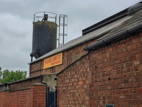
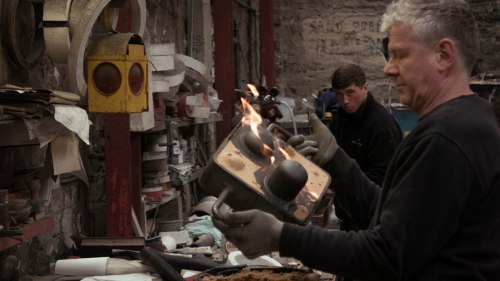
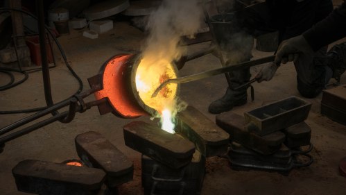
The casting was done at William Lanes in Middlesbrough. Once a town synonymous with steelworks and metal foundries, William Lane is now the last working foundry in Middlesbrough. Started in the 1890’s as a brass works, the methods used have hanged very little over the past 120 or so years. The patterns are embedded in wet sand to create a negative moulds. Lamp black is used to coat one side of the mould to prevent the second from sticking so that the patterns can be removed for making the next mould. A new mould is made for every casting. The brass is prepared from copper and zinc and melted to around 900º C. It’s then poured into the mould and left to cool. Once cooled down sufficiently, the sand is knocked out of the mould and the casting is revealed. The pouring channels and other flashing is removed along with the outer layer of sand residue in the fitting room and the the castings are then sent back to the engineers for finishing.

L1120679L1120811L1130062L1120857Snapseed 21

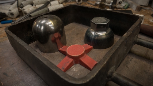
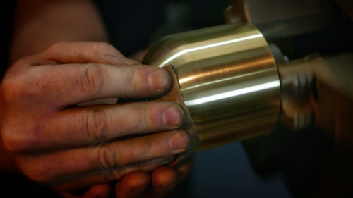
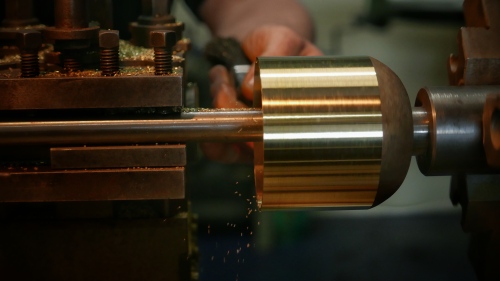
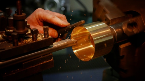
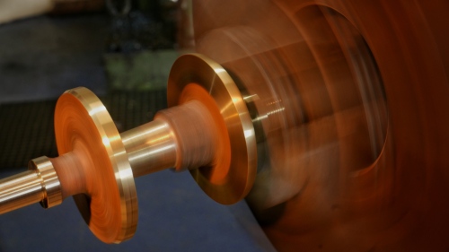
The finishing was mostly done on a lathe – the bell sections were taken down to a thickness of a few tenths of a millimetre. the angle of the knife edge being taken to around 15º (it was more accurate than that even). The cup section was similarly turned down and included a small, but vital parallel section at the top lip. The centre stem was threaded to fit inside the cup and the tuning baffle turned to the right pitch for each whistle and made a snug fit for its corresponding bell. Any gap between the bell and baffle would result in extra overtones and spoil the purity of the tone. Once all machined, the whistles were polished to a brilliant shine and numbered wth a stamp on the stem.

Snapseed 26Snapseed 24Snapseed 22Snapseed 23

The finished whistles were wrapped and crated ready for installation.

Along with the drawings made from measuring real whistles, I also tracked down an original engineering drawing for a standard whistle  – drawn at Stephenson Works in Newcastle for all engines built at Darlington. This cemented the heritage of the whistle we used. For me it was important that not only was the design we used from Newcastle itself, but that the engineering was done in Darlington – the birthplace of railway engineering. I wanted the build of the whistles to say something about the engineering history of the North East. Its so much part of the life blood of the region in understanding where its come from. But also vitally important with the narrative of the Great Exhibition that we can show that not only do these skills still exist but they exist at a level of excellence that can only come from that depth of heritage.

L1130850.jpg

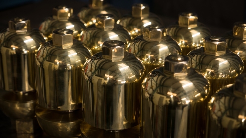
Above all, these were whistles fit for a Great Exhibition.

Read Full Post »

Up until late last night, it was feeling like proper winter here in the Durham Dales. We’d had a nice covering of snow, which despite it forecast to disappear within hours, was topped up the following night giving us two days of prettiness. It wasn’t particularly deep – just an inch or two mostly. Not enough to cause any problems, but enough to coat everything around and transform it in the way only snow can.

IMG_6353.JPG

But it’s gone now. Washed away by ‘storm’ Dylan overnight. Now there’s no trace of it left – not even in the high gunnels on the fells. Our winter wonderland is just a memory – until the next time. Preserved only in the millions of pictures circulated on social media. The fast flicked repository for all the moments of all the people.

And now, on the last day of the year, 2017 is about to fall into the vault of past years. I seem to do a blog post of the year this time every year. It’s a good time to take stock, reflect and sometimes enjoy the moments that were far too hectic at the time.

As I reflect on all the things that happened that make up my experience of the past year, there are also the things that didn’t happen.

Lots didn’t happen in 2017.

Compas‘ was to be the centrepiece for my solo show at Mellerstain House in the Scottish Borders and the launch piece for the Borders Sculpture Park. A giant, double pointed form aligned with the lines of site and travel through the estate, the angles were drawn from the slope of the lawn while the dimensions – 60m long and 16m high – were the exact dimensions of the Robert Adam designed house.

compasright

It didn’t happen.

For a new arts festival in the Lake District, to celebrate its World Heritage Site status, I proposed a life-sized bouncy castle tower to go on the top of one of the lakeland fells. From a distance it would be a visual reference point on the horizon – the red standing out against the verdant landscape. For those venturing to the top of the fell, it would be a unique experience (and a lot of fun).

keep latrigg2

There are a lot of issues with commissioning bouncy castles. It’s a steep learning curve and one that ultimately proved too steep for far too many reasons. So it was changed to a solid nylon inflatable. Infinitely easier to handle and fabricate. However, the unpredictability of the weather on lakeland fells caught us out on the day and it didn’t happen.

Attempt to install Keep on Latrigg, September 2017. Photo © Helen Tuck

Attempt to install Keep on Latrigg, September 2017. Photo © Helen Tuck

Also not happening was a floating installation in a city centre location. This might still be subject to an NDA so I can’t say anymore.

droplets

But it didn’t happen.

I almost built the world’s largest freestanding paper arch in Vienna in the spring. Situated in a prime location amongst some incredible architecture and outside a UNESCO listed coffee house, the arch was built from standard copier paper with decorative colour accents reflecting the architecture of Otto Wagner. Standing 5m high at the apex, unlike my previous paper bridges, this didn’t spring off fixed abutments. Instead this was entirely free-standing. Just paper. Nothing else.

File 29-09-2017, 19 38 56.jpeg

But arches are complicated mathematical models and what seemed like such slight discrepancies in ground levels and the behaviour of lighter weight paper than previous bridges, despite all the scale modelling and calculations, it ultimately wasn’t stable enough to stand on its own.

It didn’t happen.

What did happen though was..

XXX – my first solo show at the newly launched Borders Sculpture Park at Mellerstain House. The ‘compas’ piece was replaced with ‘Scattered‘ – a series of large white spheres floating elegantly on the lake.

scattered panorama3.jpeg

These accompanied the more architectural ‘Pointed‘ and ‘Towered‘ pieces elsewhere in the gardens.

pointed v2.jpeg

toweredbynight.jpg

Keep was successfully installed on Castle Howe in Kendal, Cumbria, on the site of the first castle in the town. Its bright red contrasting with the ‘Auld Grey Town’ and a line of sight to the slightly newer castle ruin on the other side of the town.

DCIM/100MEDIA/DJI_0293.JPG

‘Keep’ from above Kendal Castle. Photo © Tony Watson 2017

Volume‘ was a photographic series of images of very temporary installations in the Newcastle City Library. The collection of images will form the basis of a very large scale bookwork that contemplates the space within the architecture of the building through the use of time and light.

L1120014.jpg

TreeBubble‘ was the last of the inflatable installations for the year. A 5m bubble wrapped around an ancient oak tree within the grounds of the Bowes Museum in County Durham.

L1120189-Edit.jpg

It was never an intention to do so many inflatable artworks in one year. Like so many things, it just seemed to happen that way. By contrast, so far none of the major pieces I’m currently working on for next year are inflatable, but that’s not to say i won’t return to them at some point in the future.

It’s certainly been an interesting year, with lots of challenges, lots of learning and lots of great people making all these things happen.

None of these things happen in isolation. There are so many people involved with each and every one of these project – bot the ones that happen as well as the ones that didn’t. It’s a long list but they all deserve my gratitude. So a huge THANK YOU to:


Susan & Franz Brunner, Mondi Group, Jon Stynes, Peter Foskett, Jane Haddington, George Binning, Jane Malloch, Sarah Coulson, Debbie Cunliff, Navigator North, Automated Cutting Services, Hendersons Textiles, SpaceCadets, Lisa Smith, Jen Morgan, ABC Inflatables, Four Colman Getty, Penny Anderson, Archifringe Festival, Lakes Alive Festival, Phillippa Haynes, Netty Miles, Tony Watson, Amanda Sutton, Rob Ives, Ian Horn, Helen Tuck, Jane Shaw, Andrew Scrogham, Mark Thurston, Gary Chapman, Points North, Phil Carr, UTASS, The Bowes Centre for Art, Design and Craft, Matthew Read, The Bowes Museum, Sarah Collicott, ProntaPrint Darlington, Artiq

and of course, everyone who comes here to read all the things I post. Comments always welcome, whether here or on all the other social media channels.

I’ve had a sneak peek at 2018, and it’s looking OK from here. So onward and upward. have a great New Year. See you on the other side.

Read Full Post »

It’s been so long since I last posted to this blog I’ve forgotten how to begin a new post. I know where I want to end up and part of the journey of getting there, but how to start is turning out trickier than it seemed.

Art is a bit like that. For me at least it’s largely instinctive. When students or journalists ask ‘where did the idea come from?’ I usually have some kind of answer to keep them happy. But the real answer is usually a lot more complicated and involved than that.

Ideas – inspiration if you like – is an ongoing process and one that probably started at birth. There are things you remember from various parts of your life that you recall or associate with places, sounds, smells, concepts, emotions. Sometimes they may feel quite random or spurious in their association at the time. But that’s just the way your brain works. To the extent that when someone inevitably asks ‘what’s the piece about?’ the answer is rarely straightforward either. In fact Ive recently decided to put a time scale on answering that. Three years minimum. That’s about as long as it takes to absorb the work and start to understand what it was really about.

Of course, art doesn’t have to be about anything at all. Francis Bacon was famously quoted as saying “The purpose of art is to deepen the mystery”.


Presence‘ – an album by Zed Zeppelin, has cover artwork featuring an obsessive hole. The nostalgic images from the 40s and 50s appear to show everyday people obsessed by an ever present mysterious void.

cover_2551922102016_r

Art directed by one of my heroes – Storm Thorgesson – the premise was to put an object from the future into the past. In true Thorgesson style rather than use archive images from the 40s and 50s, the cover images were shot for real on the basis that ‘nostalgia isn’t what it used to be’. There’s something unsettling about a familiar setting disrupted by something that is clearly not meant to be there. Yet in these images the ‘thing‘ appears not only to be accepted, but hold a real presence in all the situations. The irony being the ‘thing‘ is not even a ‘thing’ but a hole. The ‘presence’ is actually an ‘absence’. When the concept was first pitched to the band, Robert Plant’s response was “Who the hell needs to understand everything anyway?”.

The mysterious black object motif is also drawn in part to the monoliths in Kubrick’s film  version of ‘2001 – A Space Odyssey‘.

800full-20013a-a-space-odyssey-screenshot

In the film we see three large, black monoliths  – the first in prehistoric earth that appears to mark a turning point in evolution, the second one on the moon and the third orbiting Jupiter. The monoliths are a key marker in the plot of the movie – in many respects they are what the film is all about, yet they are also a source of endless discussion and conjecture about what they are. In Arthur C Clarke’s original books, the monoliths – and there are more than just those three – have a presence but no substance, only that their shape is in the proportion of 1:4:9 (the first three squared numbers). In the books it is also suggested they have dimensions beyond the physical three with ever increasing proportions (…16:25:36…). Of course their meaning and purpose could be very simple. They just are. What are they? – something else… where did they come from? – somewhere else… when did they appear?… they’ve always been there.

In short, they’re follies. Objects designed to be mostly there to just be there. I’ve written before about the Chinese tradition of placing man made objects in landscapes to make sense of the scale, form and colour of the vastness of their environment. As a kid I was always a little obsessed by the presence of follies. I remember seeing Horton Tower in Dorset and asking my grandparents  what it was for. “It’s just a tower. It’s not for anything” was their reply. Grandparents never lie. So it must have been true. Weird, maybe. But true.

Through my teens I learnt to appreciate the surreal-ness (is that a word?) of follies. The Belvedere Tower at Claremont Gardens was always tantalisingly behind gates, locked out of reach.

IMG_4730

‘Belvedere Tower’, Claremont Gardens, Surrey. A low-resolution scan from an infrared negative, but you get the gist…

There was always something Alice in Wonderland about its inaccessibility. Those clipped hedges framing the view up the lawn. It must have been a great view from the tower across the gardens and lake, only the windows aren’t real. They’re painted on. Part of Capability Brown’s masterpiece in landscape design. The tower was there for its presence. To look over the landscape, and while it obviously couldn’t actually look over the garden, it reinforced the idea that the landscaped garden was designed to be looked over. That looking was fundamental to what the garden was about.

Another favourite was Leith Hill Tower. A wonderful piece of gothic architecture built in 1765 to enhance the countryside. No more, no less. There’s stairs up to the roof which is (at just over 1000ft above sea-level) the highest point in southern England. However, the steps weren’t built until 100 years after the rest of the building. So for a century it was just a tower for tower’s sake.


This summer I built ‘Keep’ – a 10m high folly for the Lake District. OK, so I didn’t actually build it – Debbie in Manchester did the hard work with the sewing machine. Originally it was going to be a bouncy castle inside, but a number of design issues and some disastrous fabrication decisions put pay to that idea, so it was redesigned as just a folly. It was commissioned by the Lake District National Park as part of their Lakes Alive Festival. The original brief was around the theme of Cultural Landscapes to celebrate the UNESCO World Heritage Site listing for the Lake District. The English Lake District has it’s very own and important history in the world of landscape appreciation. Unlike most of the rest of England, Follies are not part of that tradition. However, I wanted to look at the role the Lakes played in the wider English Landscape Tradition and put a folly in that landscape.

keep latrigg2

Original mock-up of ‘Keep’ on Latrigg, above Keswick, Cumbria.

‘Keep’ was designed to be a very light touch in a protected environment. As an inflatable artwork it was easy to get onto site and install. It could be installed and taken down again the same day which meant in theory it could be taken to quite isolated spots and places where a more permanent folly would never be allowed.

However, as mostly made from air, it is very susceptible to weather conditions.  On the location I’d originally intended it to go – being around 2000ft above sea level and very exposed, the weather was prone to sudden changes. On the best day of the pre festival week, the conditions looked like they would be right to get the tower up for a few hours. However, during inflation the wind suddenly picked up to more than twice the safe maximum and the install had to be quickly abandoned.

Attempt to install Keep on Latrigg, September 2017. Photo © Helen Tuck

Attempt to install Keep on Latrigg, September 2017. Photo © Helen Tuck

The following weekend was the festival itself. Confined to Kendal, the piece was installed on Castle Howe – the site of the original castle in Kendal, but with a line of sight to the latter and existing castle ruin on the other side of the town. For a day the weather played ball and the piece did its job as being a tower.

Keep 004

For the Kendal installation, I chose Castle Howe partly so that there would be some kind of dialogue between ‘Keep’ in red and the existing castle in white – rather like rooks on a chessboard – maybe another Alice through the Looking-glass reference. It was also partly about the vibrance of the colour with the ‘Auld Grey Town’, as evidenced in Tony’s drone shots.

DCIM/100MEDIA/DJI_0293.JPG

Drone view from above Kendal Castle looking back to ‘Keep’ on Castle Howe. Photo © Tony Watson.

The install on a fell in the Lake District will happen at some point. I’ll keep a look out for the right conditions, both in terms of windspeed and in the colour and light quality of the surrounding landscape. When it’s right it’ll be stunning and ‘enhance the landscape’, whatever that means.

Two months on and I’m starting to understand what the piece is about. Having seen the piece working in Kendal, I’m getting a better idea what the piece is and how it works. It’s also something I’m keen to continue in the future. That may be taking ‘Keep’ out on the road for a series of installs, or it may be more involved than that. Who knows, maybe a whole series of follies in different landscapes.

More importantly, I’m happy not really understanding what the project means yet. All good art has at least ten different meanings. I’m quite sure using temporary follies to interrogate the landscape has at least that, but it may take me a while to discover what they all are.

There’s something about follies that seems to fit with the work I’ve been doing for the past few years.  I still don’t know what that something is, except it’s probably something else. But I do know it’s always been there.


Read Full Post »

Twelve years is a long time. Twelve years ago was a very different place for most people. Twelve years ago, on a whim, I did something I’d never done before and it’s shaped my life ever since.

March 5th 2005. I don’t normally remember dates of things, but I seem to remember this one. It was a calm, sunny day and we were rowing giant red balls across Grasmere in the heart of the Lake District.

The year before I’d helped create a new festival of art in the landscapes of Cumbria and the Lake District in the North of England. Off the back of that, the local tourist board wanted to know if I could do something to get a bit of media attention for the Lakes out of season. Maybe something big? I think their original idea was something along the lines of a big red nose for Comic Relief. The normal PR stunt thing. But while they were thinking of something 12ft tall, I was thinking something over a mile long.

grasmere-copy

The original idea was a dotted line weaving the length of Grasmere – north to south. Needless to say the budget didn’t run to that, so a much smaller version was devised whereby the balls would rush towards the southern shore beneath Loughrigg with the balls getting progressively larger to accentuate the perspective.

The piece I believe was to be installed for a week or two. The balls were PVC and commissioned from a fabricator based on a farm in Devon and arrived in three large boxes that fitted in the boot of my Renault Clio. Lengths of sinking line were bought from the Ropemakers in Hawes, Yorkshire and concrete breeze blocks were bought from my local builders merchant in Kirkby Stephen for anchorage.

Grasmere was chosen as it was both a relatively small lake (one mile by half a mile, approx.) and conveniently placed at the edge of two local TV regions in the hope that both would show up and double the coverage. However, Grasmere has a little-known by-law prohibiting the use of powered vessels on it. The only way to get the balls in position was towing them in rowing boats.

balls-to-grasmere-12-version-2

The largest ball at 4m diameter. Photo © Tony West

Luckily, the Faeryland Tearooms at the top of the lake had a small fleet of boats to hire and kindly stepped in to help, along with a bunch of artists volunteering for the cause. The prevailing winds off the Helvellyn range blew north to south in the mornings and with a relatively still day the elements were on our side. That’s not to say there’s anything even vaguely easy about towing big inflatable balls the size of a small house 3/4 mile across a lake. There was a small window in mobile phone coverage so the fine-tuning of the installation was done with me halfway up Loughrigg with binoculars and a cell-phone calling the people in what from there looked like very small boats.

balls-to-grasmere-20-version-2

Starting to tow out the balls. Photo © Tony West

From the clients’ perspective it worked well. We had TV and radio coverage across the whole of the North of England, some cracking photos and a good news story of artists doing things with the iconic landscapes of the Lake District National Park.

For me it was a very steep learning curve and baptism of fire into doing things of that scale. Among the things I learnt were practical things like the importance of calculating wind drag on large objects on water (they drifted lots), and the general volume of logistics to do something that looks quite simple.

balls-to-grasmere-23-version-2

Installing the balls. Photo © Tony West

But I also learnt lots more fundamental things about work of significant scale – the way light and weather affects and adds to the piece; the way colour works in landscapes; the interaction of people in appreciation of scale; what it feels like to experince work of that scale.

l1050483-version-2

The ‘final’ installation

The public were similarly receptive too. We were a little apprehensive as to how people would react to such a bold statement, but the fact that it was temporary, had a very light touch and used the surrounding landscape to become part of the work rather than challenging it drew visitors in their hundreds. We have no idea just how many people came to see it – we weren’t even thinking about that – but the local National Trust Estates Manager reckoned it was thousands based on the carpark use alone.

balls-to-grasmere-34-version-2

Me 12 years younger!

We had no idea what the longer term effect would be. Nothing like this had ever been attempted in the Lake District. There was a perception of overprotection from major stakeholders like the National Trust and the Lake District National Park Authority. However, that the piece was successful and very positively received made it so much easier to do similar works in the landscape in the future. Certainly from where I stood it was the piece that created a significant mind change in those organisations.

file-05-03-2017-12-50-20

The following morning the balls had drifted a little. Photo © Tony West

As landscape works go, this was very simple. It was made with very little thought to a wider context or depth of meaning. In the wider scheme of things it’s not a great piece of art. This wasn’t the first piece I’d done outdoors or using the landscape, but in terms of scale it was a new benchmark. I was hooked and almost every piece I’ve created since has a direct link back to that piece.

And it was 12 years ago today.

Read Full Post »

Maybe it’s that new year thing when you start out with good intentions – bold ideas, long-term plans, fresh start or whatever, but I guess every new thing has to start somewhere, at sometime. It seems that the winter months are when I look ahead to the coming year and finally get to start working on new projects. There’s still some gaps in the overall view of the year, but from what’s already there I’m getting a feel for the overarching themes. While last year was more about textures and moments, this year looks like being one of spaces and voids. Strange how things find their own threads.

Last year I really got to know some of the river where I live. I spent large chunks of time watching it, filming it, photographing it, editing the results and creating the major piece of the year – ‘Waterfall‘. I’ll probably do a more in-depth post about that at some point, but for those new to the game, ‘Waterfall’ saw three white-washed field barns wrapped in slow-motion film footage of the three main waterfalls of the River Tees. Each barn became a visual cube of slow moving water in the night sky. It was big and awesome and probably the best thing I’d done in a long long time.

Since that piece I’ve had an uncomfortable relationship with the river. I used to go down there almost every day, but the daily photographing and research has probably made me over familiar now and some of its magic is somehow lost. I kind of know how it does all its tricks now.

So I needed to find a way to re-engage with the river. There are new things I need to discover. I need to find another story in it.

Then last week I caught up with Andy Carters ‘270’ project on his Calling All Station YouTube channel. Over the next 52 weeks Andy  is aiming to visit all 270 stations on the London Underground. To make it more interesting he has to pass through the ticket barriers at least once at every station – either coming or going through them, not just passing through on a train. It’s this slowing down of the travel that makes you stop, look, think and examine the familiar. About 40 stations in (starting with the boring bits of the  Jubilee Line) and I’m already hooked. Each station is documented on his blog as he goes along too, creating a comprehensive gazetteer of architectural gems and subterranean secrets beneath the capital.

Inspired by his journey, I’ve decided on mine – to visit and cross* every crossing of the River Tees from source to sea.

Bridges are fascinating things. I’ve had my own experiences in constructing them. Essentially they are practical engineering – a way of traversing in this case water. Yet as purely man made structures in what is on this route, mostly open countryside, they have a very distinctive presence within the landscape to manage.

Today I made a start. The purist in me wanted to start at the source and work progressively downstream. However, it’s still very much winter and as the Tees starts just below the summit of Cross Fell – the highest peak on the Pennines – and very much buried under snow for the next few weeks I’ve decided to scrap that and not be precious about the order in which I visit the bridges.

My first crossing then wasn’t even a bridge. It was also one of the biggest structures on the river – the dam wall at Cow Green Reservoir.

file-30-01-2017-17-02-50

Between 1969 and 1971, a section of the Upper Tees was flooded to create the 2-mile long Cow Green Reservoir as a part of of a series of interventions to regulate the flow of water down the river for abstraction purposes. The 1/4 mile long concrete reinforced embankment holds back 40,000,000,000 litres of water (count those zeros!) while the entire river flow is regulated by sluices on the southern bank. So technically the River Tees flows beneath it, so the dam wall is a crossing.

file-30-01-2017-17-07-48file-30-01-2017-17-03-33

The reservoir sits in a natural basin of pasture land high in the North Pennines. The landscape here is a unique blend of very specific geology and rare botanical habitat. Widdybank Fell which sits along the Durham side of the water is home to the rare Blue Gentian  and the only place in the UK where alpine plants have survived since the last great ice age. The land here is fertile and remains of bronze age summer farms lie beneath the reservoir – themselves an indicator of how climate changes over time. Back then temperatures in these upper fells were around three degrees warmer. It might not sound much but the weather here is now too cold for most wading birds to breed on the reservoir. On a fairly bright day like today it felt relatively mild a few miles downstream, yet up here the shaded bays on the water are still iced over and pockets of snow lie in the heather.

file-30-01-2017-17-01-52

Today the reservoir sits in the Moorhouse National Nature Reserve – the largest nature reserve in the UK taking in the highest fells in the Pennine chain and the upper catchments of the River Tees.

The wall is an immense brutal slab of industrial infrastructure. Its scale and construction means it’s never going to blend in (whatever that means) and makes a bold statement within the landscape. Yet, the sparsity and relative bleakness of this part of the dale tolerates its monolithic brutality. The scale of the landscape seems to just swallow it up. As the river rushes quickly away from the wall thinly over bedrock, there is a greyness and roughness, that is almost alien in spirit and the concrete meets the bedrock as an ancient ancestor and the family resemblance is still there.

Within yards of the wall, the river passes beneath Birkdale Footbridge. This is the first of the bridges in County Durham and is still a border crossing between Durham and Cumbria. Built in 1966 – and just predating the dam wall – it’s made from a concrete span sitting on two reinforced stone pillars in the river. Like the dam, it’s a very utilitarian structure and supports a private access road and the Pennine way.

Downstream of the bridge the river disappears down a series of dramatic cataracts between basaltic columns of winsill. At a total of over 200ft, Cauldron Snout is one of the main waterfalls of the River Tees and shows how fast the water develops its wild character from the man-made sluices of the reservoir.

file-30-01-2017-17-21-18

So this is where my journey this year begins. I’ll back track when it’s warmer to find the source of the river and the only bridge beyond the reservoir, but I’m looking forward to discovering the journey of the water from the sluices as it cuts its way through the landscape towards the sea, and how people have built ways of traversing it.

It’s a long a winding story and I’m looking forward to discovering the stories and narratives of those crossing places. it’s a rich history and along the way I’m going to find Romans and Saxons, and JMW Turner and Lewis Carroll and railways and steel and plutonium. Lots of landscape and lots of engineering. And lots of walking.


*ok. so I won’t walk over the railway bridges,or motorway one and will probably give the pipe bridges a miss too

Read Full Post »

The middle of winter is certainly feeling like it this year. It’s not particularly wintery in the weather, but it certainly feels darker and more gloomy. Anyway, we’ve past the shortest, darkest day, technically. Now the days are getting longer again we can look to the future and think about the year ahead. But it’s also that time of year where we look back at the past year and take stock.

For me 2016 has felt like a particularly busy year. The tail end in particular was a bit hectic at times. But it’s been a productive one. Lots of new things – new people, new works and new places to work with.

‘Lotus Souvenir’ – large origami lotus flower installation at Bicester Village, Oxfordshire. UK. in February.

Lumb Mill Viaduct

Lumb Mill Viaduct

‘The Scenic Route’ was a short research residency walking two former railway lines in Lancashire.

‘PaperBridge’ had a variety of outings over the year – includig being featured on a TV show on the Discovery Channel, being in a book on micro architecture and being presented to the King and Queen of Lesotho. A smaller working model was shown in an exhibition of paper design in Chicago, while drawings and a short documentary was shown in Nova Scotia and Montreal.

September saw the start of a series of back-to-back installations right across the North of England, starting with ‘Tower’ – an architectural intervention at the Festival of Thrift in Kirkleatham.

From September to November I did a series of installations across Lancashire for a commission. ‘When the Red Rose…’ saw temporary interventions in Preston, Blackpool and Lancaster. A fourth on the canal at Blackburn sadly didn’t happen, but I’ll keep that one back for another day.

The major piece of the year however, was just three fields away from where I live.

Three barns were wrapped in slow-motion projections of waterfalls from the nearby River Tees. Over six short nights over 2,000 people ventured to see the work, in the dark in a quiet, remote corner of County Durham. Blessed by a harvest moon the first weekend and by clear skies with resident milky way the second, no number of photos or videos can ever capture the experience those lucky 2000 had.

While it was a good year for interesting and ambitious new works, for me ‘Waterfall’ stood out as probably the best piece I’ve done so far. And to do it on my own doorstep, in front of my own local community was a particularly special thing to do.

Just as good as being able to do all those installations, exhibitions and workshops was all the wonderful people I got to work with. None of these can happen without teams of people dedicated to making them happen – from those commissioning the work and those fabricating some of the pieces to those who work tirelessly to promote the work or organise the epic tasks they can sometime become. So hopefully I haven’t missed anyone off but here goes:

Nancy Kryzanowski, Gemma Jackman, Sally-Anne Blaise, Caroline Ruddick, Paul Gray, Phil Carr and Alan Carr Print & Design, Premier Papers in Gateshead, Nick Hunt, Melanie Diggle, Diana Hamilton, Roy Halliday, Nick Lund, Julie Tomlinson and James Cropper plc, Lexi Gerry, Jon Stynes, David Metcalf and October Films, Aleta Florentin, Vianna Newman, Harvey Lev, Judith Bauer, Diane Spark and all at UTASS, Ian Hunter, Paul Chaney, Alex Murdin, Henk Keiser, Brenda Vrieling, Jan Hartold, Vicky Holbrough, Nicola Golightly, Stella Hall, Trevor at Kirkleatham Old Hall, Christina Hesford, Janet Rogers, Paul Murray, Becky Nicholson, Kirsty Childs, Jill Bennison, Karen Marshall, Kate Percival, Lowri Bond, Sara Cooper,  Jane Shaw, Fiona Goh and Holmfirth Arts Festival, Sarah Branson, Jamie Frost, Thomas Charveriat, Sarah Gent, Sarah Mayhew-Craddock, Lucy Jenkins, Rebecca Turner, Harry and Kate Vane, Ewan Alinson, Jill Cole, Malcolm Walton, William Burton, Chris Woodley-Stewart, Nicki Cullens, Shane Harris, Mark Tyler, Ryan May and Hightlights, DCC events team,  Lyndsey Waters, Tim Joel, Richard Baxter, Rita Whitlock, Ella Byford, Justina Ma, Sally Jastrzebski-Lloyd, Anna Izza, Hannah Leighton-Boyce, Keri Sparkes, Jen Morgan, Catherine Shaw, Philippe Handford, Jamima Latimer, Louise Miller, Mike Neale, Stacey Walker, Julie Brown, Sandra Blue, Brent Lees, Friends of the Storey Garden, Rebecca Johnson, Laurie Peake, Sarah Steele and Preston Methodist Chapel, Alex Rinsler, Mykey Young, Richard and the Lightpool team, Zoe Dawes, Jenny Needham, Flossie Mainwaring-Taylor, Trevor Brookes, Martin Paul, John Gillmore, Heather Fox, Jennie Collingwood, David Turner, Andrew Barton, Paul Kingston…

I hope I haven’t missed too many off. That’s quite a team and a huge thanks to everyone on the list – I seriously could not have done all I have this year without each and everyone of you.

So, that’s it for this year now. Next year is another year. It’s going to be an interesting one for so many reasons, but I hope it’s more in a positive way.

Onwards and upwards…


Read Full Post »

Now I’m all settled, I need to get back to doing some work.

At the start of every project there’s usually a long period of research and development where I immerse myself in finding out about things and getting really lost in lots of new stuff. At the moment I’m working on a number of future projects at various stages in their development.
It’s quite possible that one or more of these projects never makes it off the page and becomes a final piece. It happens. Quite a lot sometimes. Sometimes the ideas carry on and inspire another piece. Sometimes projects just take a really long time to happen.

This piece for a hi-end luggage brand never paid off:

cases in a circle

Although this piece proposed for Brockholes Nature Reserve near Preston didn’t happen (huge shame), it did lead to a similar piece in nearby Lytham:

bubbles at Brockholes

and this piece for the Forest of Bowland is far more complicated than expected and is still a few years away from happening:

tangled in the trough of bowland

Recently I’ve been doing some research at the Lancashire County Archives for a couple of projects. It’s an amazing place. It’s not a library nor is it a museum, but contains millions of documents relating to just about everything that’s ever been written down in or about Lancashire. From elaborate illuminated manuscripts on vellum to folders of stapled typewritten council memos.

The building itself is a very considered bit of 70’s local authority brutalism.

archives building

There are boxes of files there which chart the history of the designing and building this purpose-built archive building – memos about materials, sketches of the custom furniture, salaries and running costs.

chair sketches

In the centre of the main building is a square courtyard. The architects proposed a sculpture and water feature in the middle, which never came to anything, but there’s a whole presentation document about it.

sculpture proposal

It’s not a great piece of art proposed, and the design of the presentation isn’t ground breaking either, but what struck me was the thought and care that went into proposing the project.

The master of the proposal presentation though was Humphry Repton. A self-taught landscape designer he sought to develop the ideas of Capability Brown and a had a clear vision of how the parks around the great houses could be greater experiences and encapsulate the new ideas of the beautiful view. He also developed a very unique business model. He would visit the great houses and spend a few days sketching the various views, looking to see how changes to the parks and gardens would affect the overall impression and experience of the house. He would then present a bound book of his ideas to the owners as a pitch for work. The books would be around 20 or so pages long with beautifully written descriptions of the house and land. The highlight of the books were the fold-out pen and ink drawings with flaps and pop-ups showing before and after visuals.

before after

The pitches were mostly unsolicited – he relied on some of the ideas to be taken up in order to make a living. For him the presentation of the ideas was key to that. As bound objects, Repton’s ‘Red Books’ have mostly survived – being absorbed into the estate libraries. Surprisingly few of his ideas were actually fully realised. If he was lucky then maybe one or two ideas at each site would take shape – but for Repton that law of averages was all part of the plan.

The Lancashire Archives have an original Red Book for Lathom House. As a public archive anyone can request most items. However, the Repton Red Book as a one-off hand written and illustrated book is a bit fragile for repeated handling, so the conservation department made an amazing facsimile for anyone to explore. It has the same binding, paperweight and everything so you get to experience Repton’s charm-offensive in all its glory.

copy of repton red book

I don’t think any of Repton’s ideas for Lathom House ever came to fruition, but as a work of art – of ideas as well as visuals – it’s just as valid.

This got me thinking of the value of proposals. They are ideas in the raw state. The great vision. At the idea stage they’re often uncompromised by logistics or money or technology. There are far more things that never happened than have. In that light the archives hold a fascinating document of what if..

Some are visually things of beauty –

This is a proposal for decoration of the hallway in Lytham Hall (never happened). I love the way it’s presented as the 3D space folded flat.

IMG_7128 - Version 2 IMG_7130 - Version 2

Less visually arresting is this proposed railway through the Forest of Bowland. Built partly for local transport for people and agriculture, the financial sustainability case was built on tourist use – years before the creation of National Parks but they still anticipated summer tourism passengers of over 30,000 every year. Had this been built it is possible the Forest of Bowland would have been as busy as the Peak District and with a developed tourism industry as a result would have strengthened its case for National Park status.

bowland railway

There are thousands of architectural drawings in the archive – from railway cottages and Cooperative Society buildings to canals and service stations. But by far the most impressive is that for the Morcambe Tower.

IMG_7148 - Version 2

In the early 1890’s there was a bit of a tower fever. Inspired by the Eiffel Tower opened in 1888, entrepreneurs around the country saw building iconic landmark towers as the key to building tourism with the new concept of disposable income. In 1890 both Blackpool and Morcambe revealed their plans for seaside towers. Blackpool’s at 158 metres unashamedly ripped off was directly inspired by the Eiffel Tower. Morcambe’s was far more ambitious…

morecambe tower

At the base was an intricately decorated Moorish-designed Bazaar featuring shops, restaurants and grand theatre. Above that sat a second auditorium for a circus. Rising above all this was a tower more inspired by the Tower of Babel than anything else. A spiral roadway wound itself around the spire with an illuminated tramway carrying people to the viewing lantern on the top.

Just stop for a moment. That’s like a railway running around the outside to the top of Blackpool Tower…

These drawings from the architects – by W.H & A Sugden of Keighley, Yorkshire, are incredible in their level of detail. These are not a decorative proposal – they’re working drawings to actually build this thing. There’s even a detailed drawing of one of the hinges on one of the ground floor bars.

hinge

The depth of detailing is mind-blowing. Bearing in mind that at the time this would have been the tallest building ever built – that Tower of Babel inspiration is not quite so kitsch.

decor detail

Sadly, like so many great ideas, it didn’t really go to plan. The money didn’t materialise and the buildings were scaled back. The Tower never got beyond its steel work sub-structure.

morecambe bay C1900

Morecambe Bay C. 1900. The tower as built can just be seen in the distance on the left. Image © Lancashire Libraries


The tower was dismantled for the 1st World War effort. No doubt the ironwork melted down and turned into guns and shells. From pleasure to pain in one easy line. The buildings were finally demolished in the early ’60’s.

Compromise is the enemy of inspiration and some ideas should never have got beyond the proposal stage – not because they were bad, but precisely because they were perfect as they were. The act of realising them inevitably opens up the risk of things going wrong, or worse – tweaked for budgetary constraints.

Of course I always set out with the ambition to realise every one of my proposals, but realising that the proposal presentation may be as far as any idea gets I’m enjoying working on all the details for these pieces.

The art of ideas.


Read Full Post »