We did it!

Yep. That really is a monk next to it…
After five full days of long hours and really dedicated graft, the ‘Carpet’ piece is gracing the Priory on Lindisfarne for the next few days.
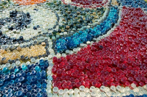
It took 22,000 bottles and 2,500 litres of water mixed with vegetable dyes to make it. I know it was hoped to be 30,000 bottles, but that proved just too much even for my optimism. Still, over 20,000 is still a shed-load and way more than you can count so I doubt anyone will notice. When the sun comes out the piece really becomes alive. It’s immense.
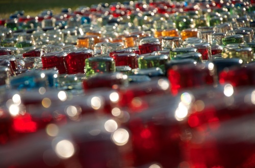
There was something appropriate about the scale of the task I’d set and the long hours of physical repetitive work. We typically did 11 hour days filling the jars with measured mixes of dye and water to get just the right colours, then taking quantities over to the artwork for laying out. By the end of each day we were utterly exhausted and ached all over. I knew it was going to be hard work but never imagined it being quite so physical. Yet, in a strange way the aches and morning stiffness became part of the process and part of the piece.
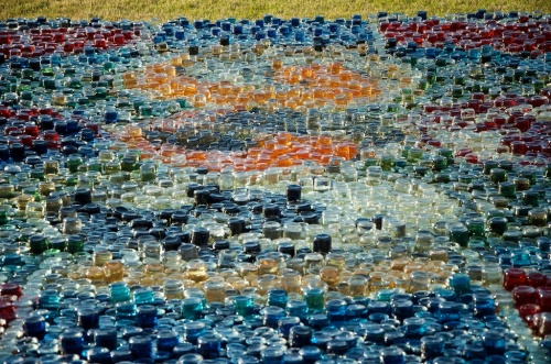
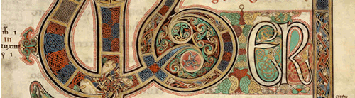
I wanted to create a piece which said a whole bunch of things about the Lindisfarne Gospels and linked them to the place. Starting with the idea of pots of ink as a simple connection to the drawing of the original designs, it was also about the use of colour in the manuscripts as a reflection of a multicultural Britain in the 7th century. It was also about how the colours in the inks were the product of the island – why import materials to make ink when you can make them all from local sources? The colours used are not only made from local materials, but the palette is informed by the colours of the island – all the familiar sights and tones. Even the decorations in the originals are inspired by the world around the priory. These bird heads are clearly based on the gannets:


Gannet – image © Tony Heald / naturepl.com
I didn’t want to recreate one of the original carpet pages. Besides not being a particularly original thing to do (where’s the ‘art’ in that?), had I done so there would always be a comparison to make and due to the coarse resolution of the jars, probably quite an impossible thing to do. instead I wanted to create a new pattern for the here and now, but made exactly the same way as the original patterns. It’s a bit like experimental archaeology where you get a real feeling for the historical process by actually doing it. For me that also meant creating a pattern as a direct response to the site and the location through the medium of the original design.
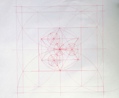
First off I needed to find how the patterns were made. The original carpet pattens are a mixture of Celtic, Pictish, Viking, Saxon and Egyptian influences. You can still see a direct descendent of that process in Islamic art today. Hardly surprising when you consider that Islam started at the same time the Lindisfarne Gospels were written and both have middle-Eastern origins.

Vitruvian Man by Leonardo da Vinci, Galleria dell’ Accademia, Venice (1485-90)
I based the basic layout on Saxon pattern-creating methods. In 7th Century Britain there were no rulers marked with inches or centimetres. Instead, the key points on the pattern were determined by ‘sacred geometry’. Taking a vertical centre-line of a known length, the rest of the pattern is derived from arcs and circles. Radii are then taken from those intersections to create further arcs and circles. The whole thing can then be scaled infinitely while preserving the proportions. It’s those proportions that all the carpet pages in the Lindisfarne Gospels are based on. Again, it’s just the beauty of maths and the purity of the geometry of circles that does this. It’s the same geometry that Da Vinci used some 800 years later. (above).
OK. So, it wasn’t just me. There was a whole team of people doing it. Most notably Bryony Purvis who generally took charge (in a good way), and Andy Raine, who just did everything with a smile and lots of energy. We also had big chunks of help when we needed it most from the time-lapse photographer Cain Scrimgour, fellow artist Helen Tuck, a class full of brilliant kids from Easington, Andy’s wife Anna, and the PR team from English Heritage who mucked in for a few hours. Even Wayne, the overnight security guard got his hands coloured from time to time.
It was a real team effort. Great team. Great effort.
Here’s Cain’s time-lapse video of the epic install:
Carpet – Gospels on the Grass from Cain Scrimgeour on Vimeo.
————————————————————————————————-
Yesterday I spent an amazing hour in the presence of the largest collection of Anglo-Saxon books in the UK. Having immersed myself in weeks of research and then a gruelling week installing an artwork inspired by them, it was a particularly moving experience to see so many so ancient manuscripts.
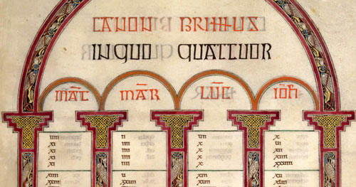
The Lindisfarne Gospels are currently on display in Durham – a bit of a homecoming as that’s where they spent a good 500 years or so. The exhibition on Palace Green has also brought together most of the surviving 7th and 8th Century books including the Durham Gospels – reputed to be the original source of the Lindisfarne Gospels. By comparison, the few early medieval (11th & 12th century) manuscripts seemed positively modern and strangely not half as interesting.
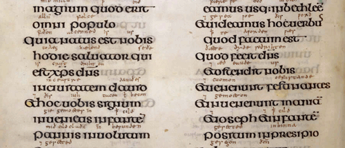
The whole history of these British manuscripts is a fascinating one as is that whole era of early Christianity in the North of England. In the 7th century there were two main sects of Christianity – the roman church and the missionaries from Ireland. One of the main points of contention was the calculation of the date of Easter. THis was resolved at the synod of Whitby in with the irish church losing. The uncial script used in those early books was a way for the dejected irish monks to assert their allegiances. I love that subversive undercurrent. kind of still two fingers up to the establishment.
The designs used in the Lindisfarne Gospels reflect the cultural hot-pot of those monastic communities. There are elements of Pictish, celtic, saxon and even Egyptian and middle-eastern design in them. Multiculturalism isn’t just a 21st century thing – it’s been going on here for centuries. It’s the fabric of Britishness. Take that you EDL folk!
However, the most amazing part of the exhibition was in the room where the original Lindisfarne Gospels were. They themselves are stunning. Pictures in books and online can never do them justice. The level of detail, the fluidity of line, the intensity of colour is just breathtaking. I can honestly say I’ve never seen anything else that comes even close to their refinement.
And as if that wasn’t enough, also in that room were artefacts from the coffin of St. Cuthbert – the guy who commissioned the Lindisfarne Gospels in the first place. I’m not really big on religion – it’s just not my thing – but seeing the possessions of a saint an incredible thing. His cross, and ring in particular, look as if they had just been made. The craftsmanship was staggering. And then the thing that finally blew me away was his own copy of the gospel of St. John, buried with him in the 7th Century. A little leather-bound volume – like a paperback novel. This is the oldest surviving book still in its original binding. In the world. We’re talking a book that’s nigh-on 1,400 years old. Still in one piece. Still looking as though you could just pick it up and read it.
St. Cuthbert’s Gospel. image © British Library
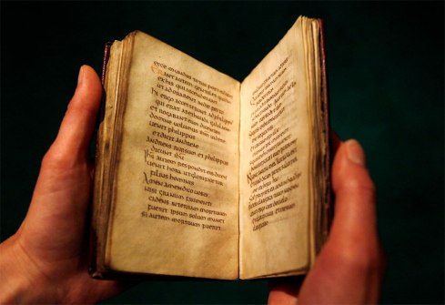
St Cuthbert’s Gospel. image © British Museum
Sometimes words fail me.
